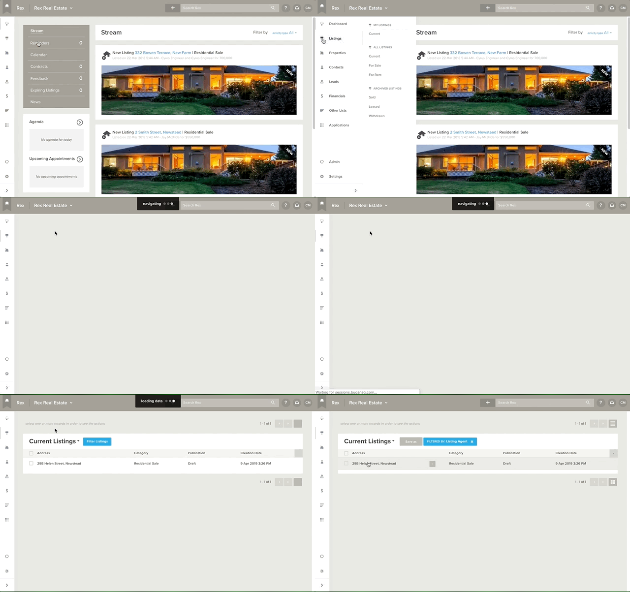
The new menu will be launched on Monday 15 April. Try it out before the big shift next week.
When we built the Rex menu, we couldn’t have anticipated all the new features we’d build. So, much like our favourite pair of jeans, we’ve slowly outgrown it over time. Next week we’re releasing the new Rex menu (before we release too many new features, and our old menu busts at the seams)!
Those of you who opted-in a few weeks ago will already know your way around. For those who chose not to get early access, keep reading for a quick run-down of how to navigate the new Rex menu then follow the instructions here to have a play.
All the important stuff is at your fingertips
… or cursor, you get the gist. The point is, we’ve made Rex easier to navigate by improving the information hierarchy in the menu. A few modules have been separated out, reordered or renamed to make things simpler for you. It might feel a little different but you’ll be whizzing around in no time.
As with all our features, the new menu has been through extensive user testing. We’ve made sure that the modules you use daily (and those that your admin users access hourly) are accessible in as few clicks as possible. For example, we’ve given you a new shortcut to access all your current listings!

We’ve even developed three different versions (for desktop, tablet and mobile) to make it easier for you to use Rex when you’re not at your desk.
The new Rex menu on your desktop
The first thing you’ll notice is that the navigation menu has moved from the top of the screen to the left hand side. Your search bar, profile link, support link and inbox have all shuffled around ever so slightly, too.
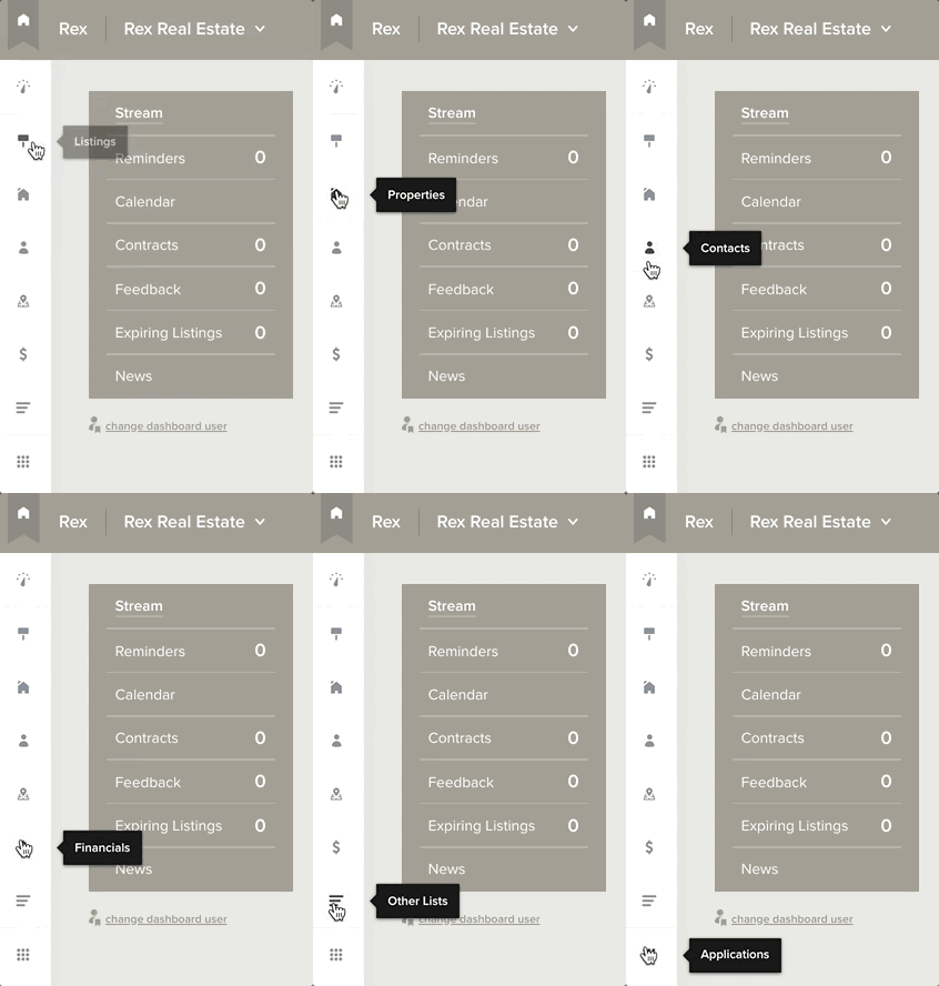
The menu has also been condensed into icons, leaving more screen space for you to work with. Power users will be happy about that.
The first level of the menu will appear when you click on any part of the menu. Rex will also show you a tooltip showing the name of the menu item when you hover over an icon.

If you’re still finding your way around Rex and haven’t had time to memorise the new icons yet, you can pin the menu permanently in its expanded state by clicking the arrow in a grey box at the bottom of the menu.
Once you know what you want to access, click the main menu item you need, and the second level of the menu will slide out.
To exit the menu, simply click once anywhere outside the menu.
The menu lists are almost identical to the original Rex menu, except for a few small tweaks. Financials, System Lists and Settings have all been pulled out of the Admin list, and given their own spot in the first level of the main menu. Turns out you use these sections all the time - so we thought we’d make them easier to access.
… on your tablet
The tablet version of the Rex menu is very similar to the desktop version. To use the menu, simply tap on the menu item you want to access. Tablets don’t support hover, so the tooltip won’t appear.
Tap anywhere outside the menu to minimise it. Simple!
… and on mobile
The old Rex menu was a little fiddly to use on mobile. Unless you were genetically blessed (or cursed?) with child-sized fingers, you probably tapped the wrong menu item more than a couple times (the “fat finger” effect according to urban dictionary).
To be fair, we built Pocket (and made it free!) so you could take Rex on the road with you. Pocket is specifically designed to put the most important parts of Rex right where you need them, and features some cool additions to boot (like open home functionality and post-call workflows). We’re all about choices though so if you still feel the need to access Rex on your mobile this feature release makes things much easier.
To use the new menu, all you have to do is click the hamburger to expand and again to minimise.
When we roll out the new Rex menu on Monday 15 April, you won’t be able to go back to the old one. So have a play and enjoy a world of faster navigation.
We hope you love it as much as we do!


